Brand identity · Interactive pitch deck
Aquadeep

The brief
Aquadeep's old identity had no structure and didn't show how advanced the product was. The brand needed to look precise and reliable, like the AI platform behind it.
01 / Process
Brand platform and name
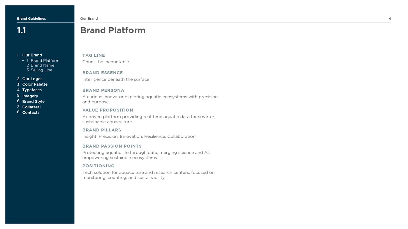
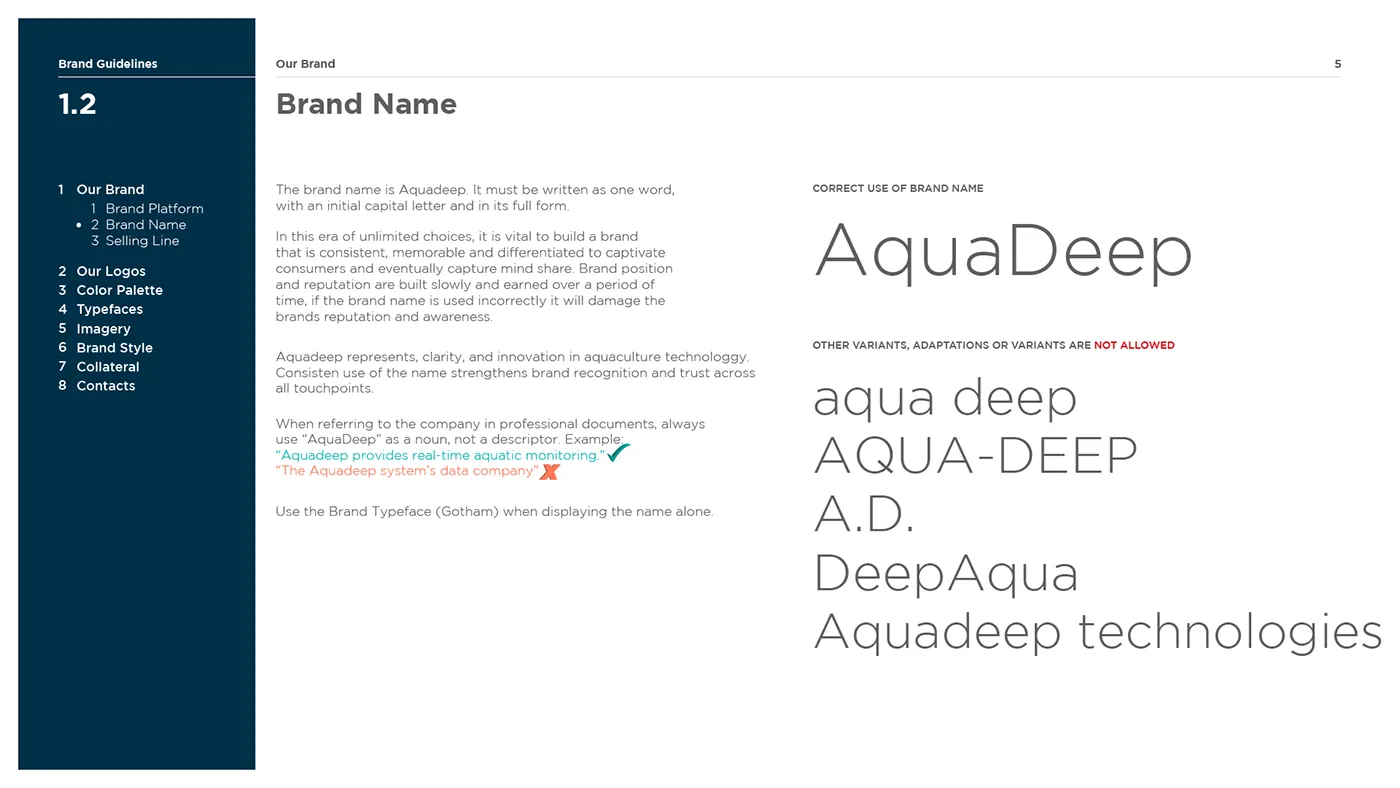
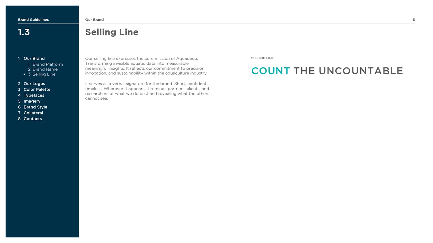
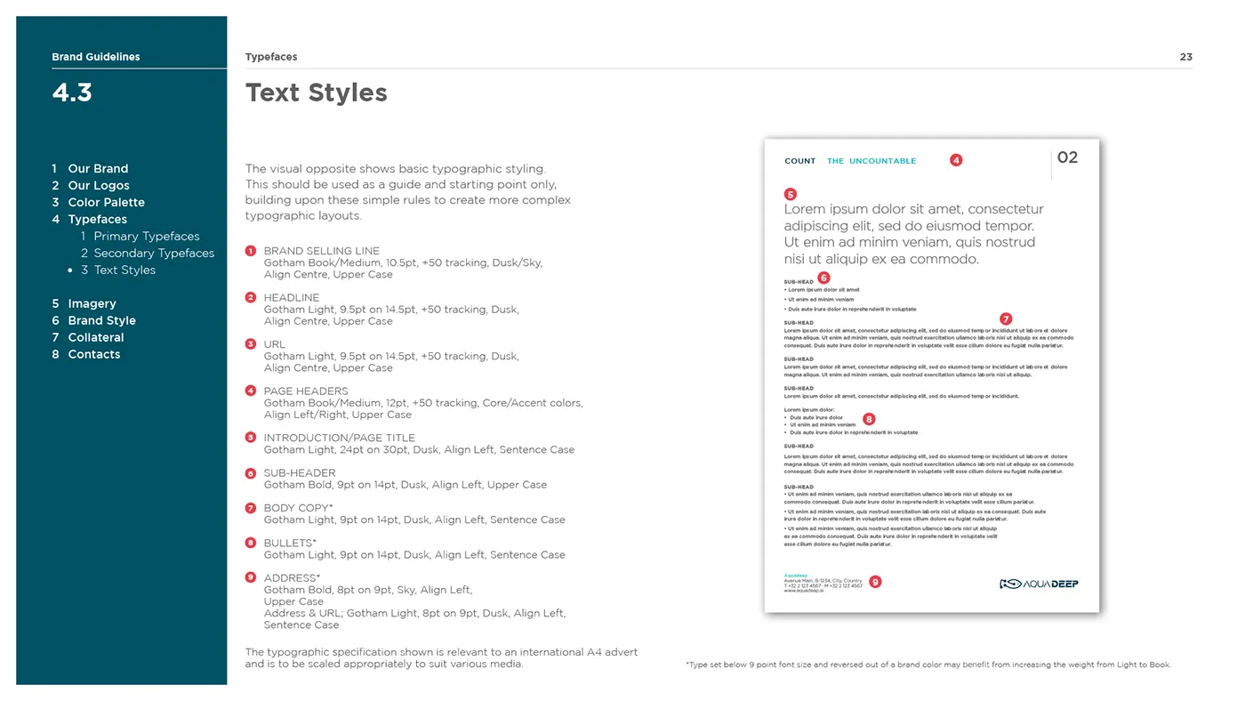
I started with the platform: what Aquadeep promises, how it sounds and which name format to use everywhere. That led to the line "Count the uncountable".
02 / Process
The mark
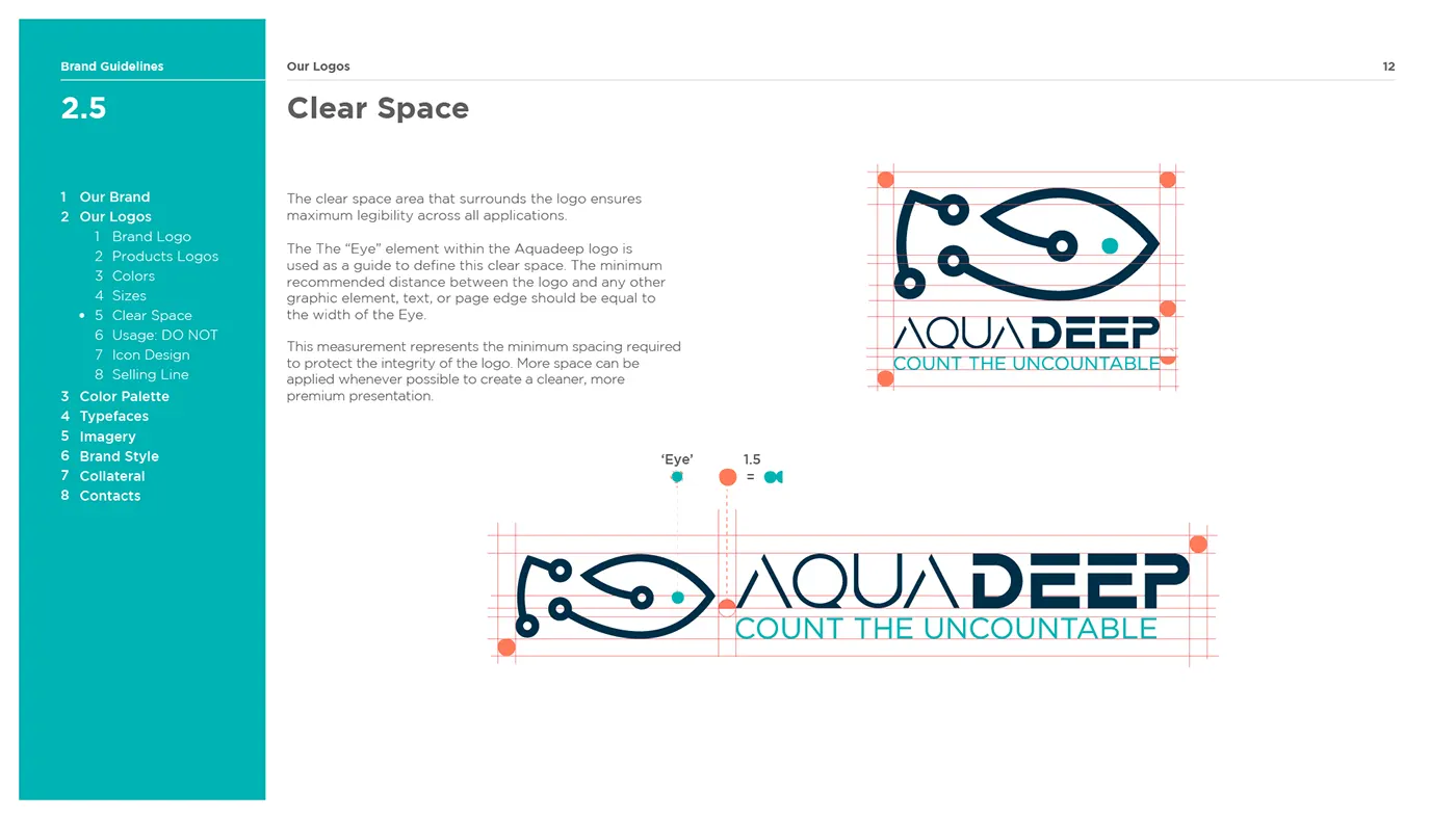
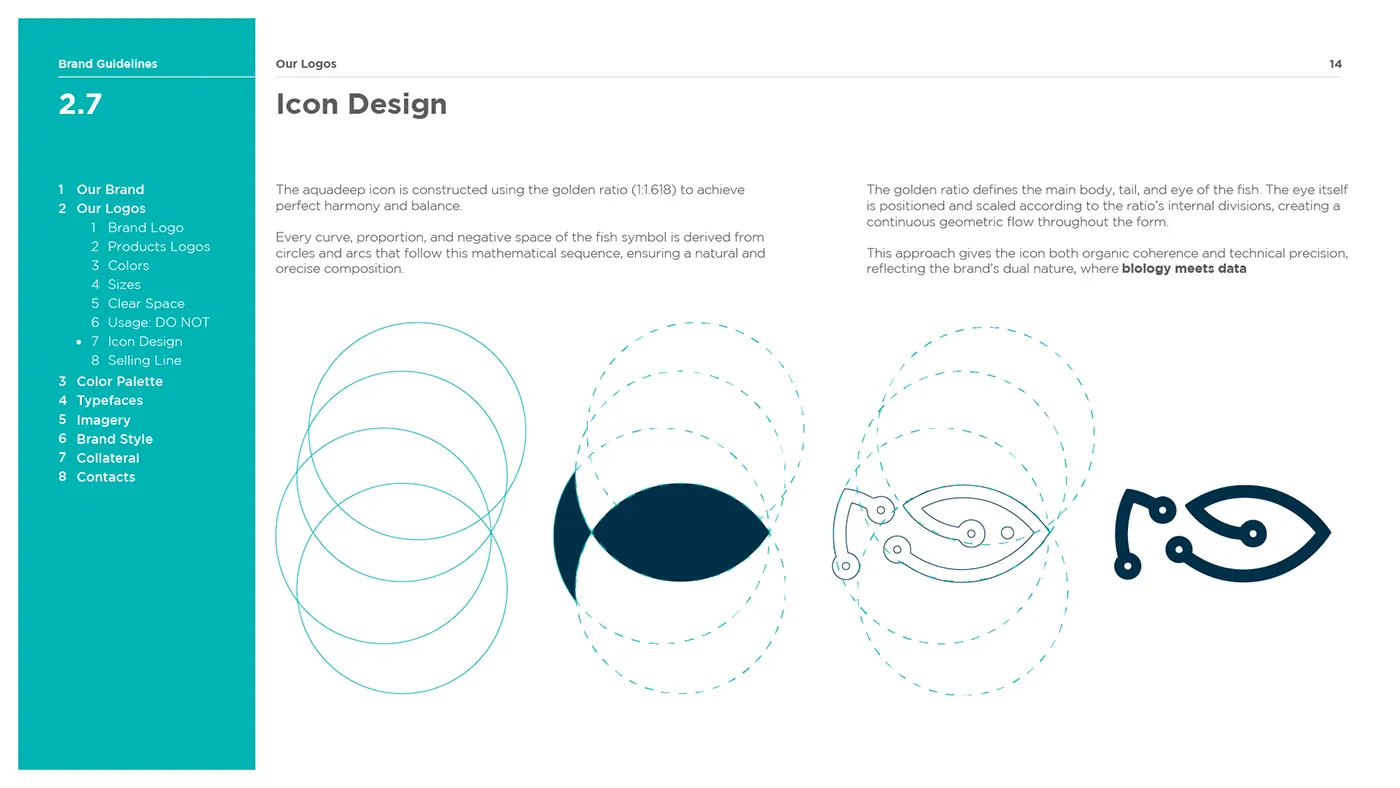
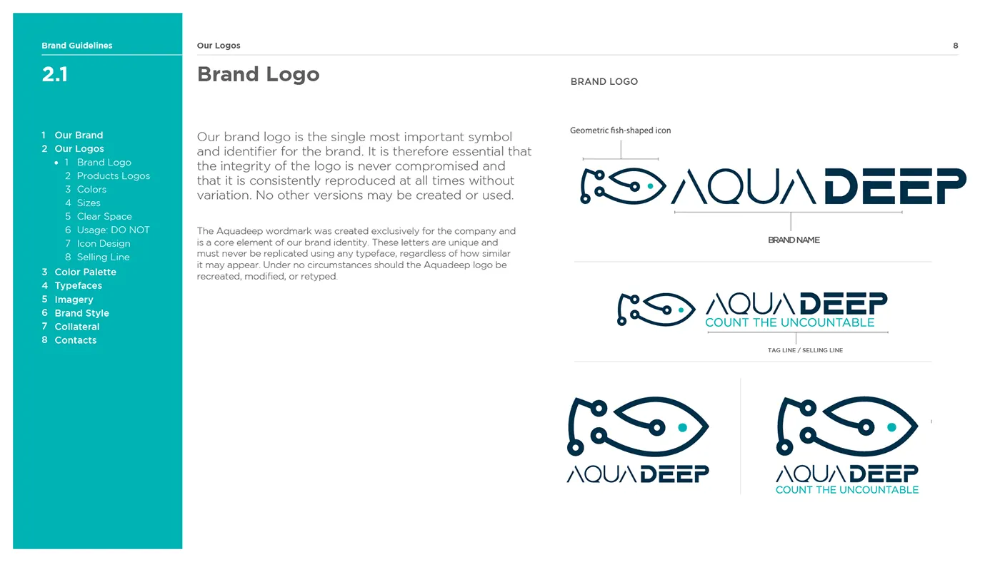
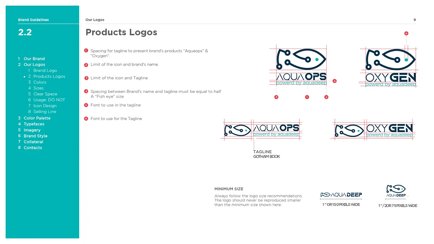
The fish symbol is drawn on a circle grid, so it holds up as a small app icon and on a building sign. I drew sub-brands (Aqua Ops, Oxygen) from the same system.

03 / Process
Colour and type
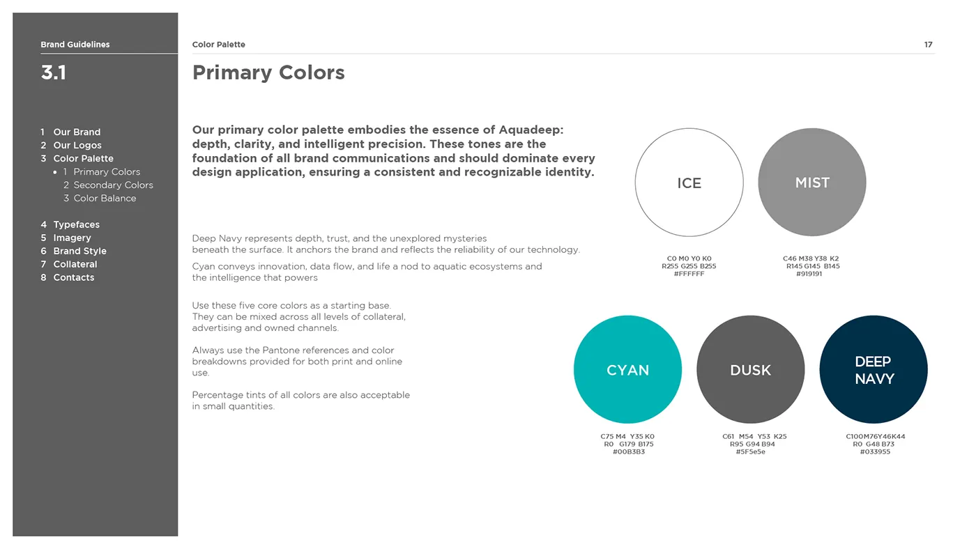
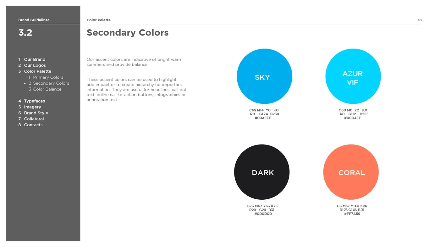
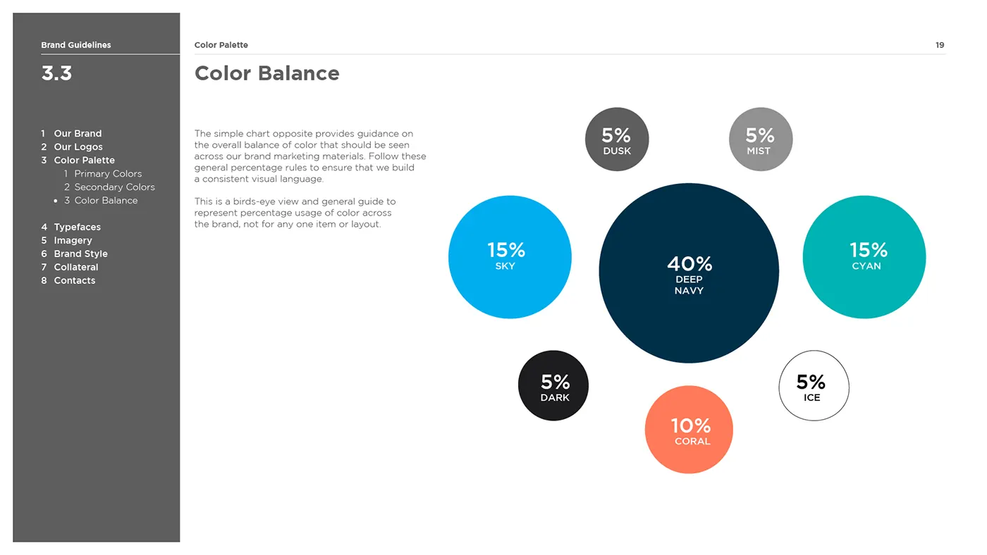
Deep navy and cyan carry the brand, with coral kept for alerts. A colour-balance chart sets how much of each to use, so the brand looks the same in every file.
Interactive deck
Loads Figma Slides from figma.com.
Deliverables
- Logo and sub-brand system
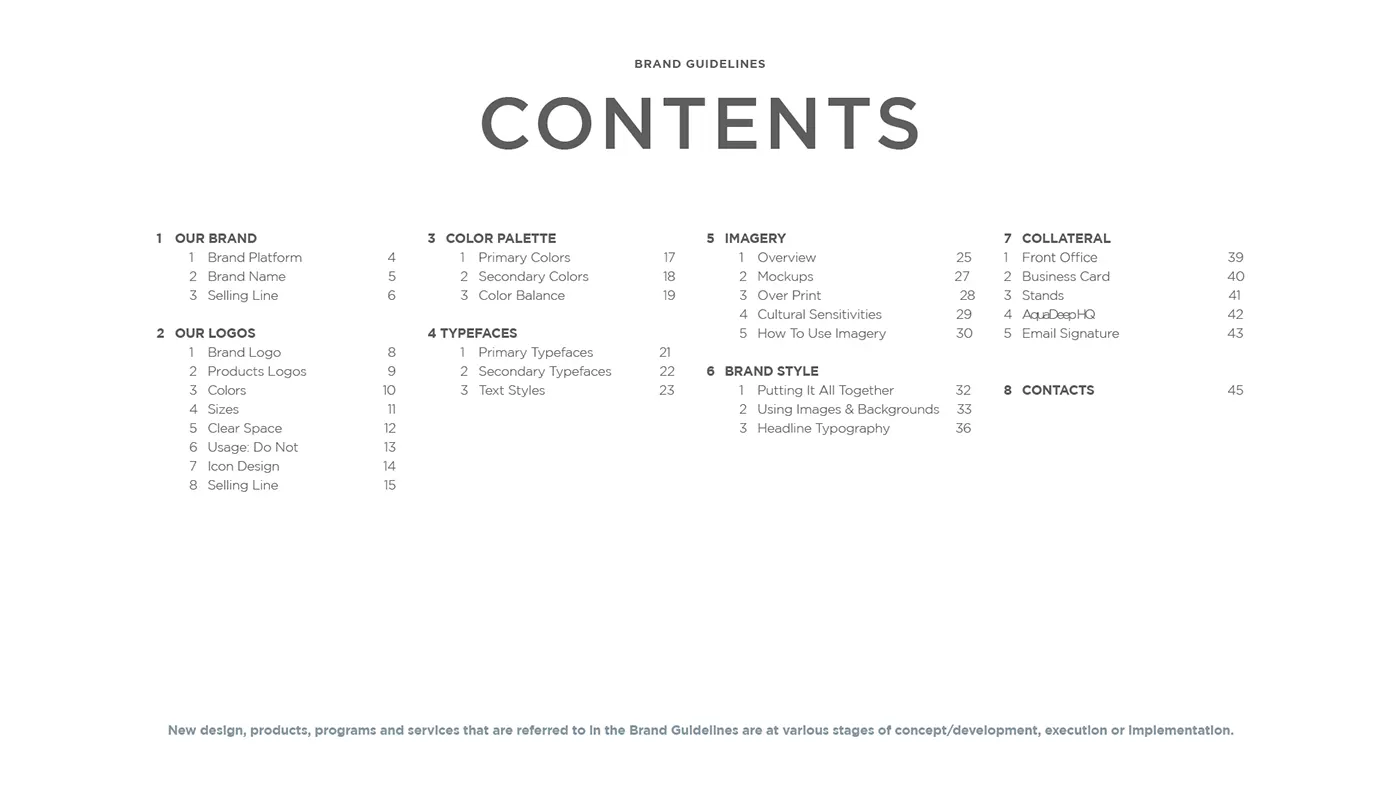
- Brand guidelines
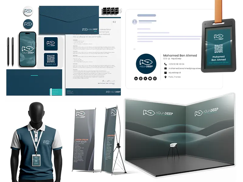
- Stationery and signage mockups
- Interactive pitch deck (Figma)